WATERCOOLER CHAT: Sherwin-Williams Colormix® 2025
According to Sherwin-Williams’ Director of Color Marketing, Sue Wadden, the Capsules collection is an exploration of the magic contained within the colors, materials, and finishes that will inspire innovation, create connections, and illuminate the future of residential and commercial design. The SW Colormix 2025 Capsules collection takes a look at the 48 most trend-forward hues for 2025.
Color significantly impacts the way we work. Each year we were excitedly awaiting the SW Colormix 2025 profiles to see what is in store for your next-level office refresh. This past year has revealed some exciting inspirations for the future of work, including the cross-pollination of:
- Interactive spaces inspired by digital experience design
- Curated spaces reminiscent of museum exhibit design
- The task-based design of activity-based workspaces
- Brand-focused elevated small business workspaces
Finding where your business journey fits into these changes is worth delving into every aspect of your brand from color selection to a revamped floorplan that allows your team to flourish in a residential-inspired workspace that motivates the return to work. The Sherwin-Williams team of experts has crafted a forecast of hand-selected key commercial colors, woven into each residential color palette. Since resimercial design remains a vital part of office design moving forward, the SW Colormix 2025 synopses are a hybrid of commercial and residential color stories with fresh insights to revitalize your office design! Our design team is available to help you visualize your office upgrade! Get inspired by visiting our Workspace Color Stories page!
 Chrysalis: The residential tone is intentional living and future thinking merged into a palette of subtle neutrals—live-edge wood, sifting sands, and turned earth—capturing a feeling of sanctuary and the essence of a single, enduring moment. By merging organic aesthetics with groundbreaking product innovations, commercial design continues to metamorphose, redefining luxury by drawing upon sustainable materials, sophisticated color palettes, and earthen textures to create dramatic displays of raw minimalism.

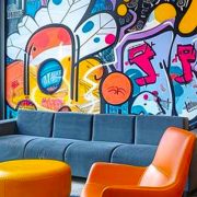
Paradox: The residential tone is at once free-spirited and philosophical, sweet and subversive, wild and welcoming, this dopamine-drenched palette exchanges precedent for playfulness with electric brights, grounding neutrals, and candy-coated accents. Otherworldly, immersive interior design creates a diverting sense of depth in commercial spaces where fun serves a functional purpose.
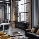 Wellspring: The residential tone here marks the return to our shared heritage with a palette symbolic of deep connectedness to the land, to the work of our hands, and to narrative-rich colors that help us tell our story. The colors of Wellspring speak with deep respect for ancestral teachings, honor the wisdom found in each act of discovery, and help us find meaning in collective creativity. Today’s commercial designs transcend traditional aesthetics while paying homage to a mix of timeless artistic visions.
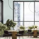 Kindred celebrates uniqueness and nurtures the notion of communal well-being with a collection of warm-hearted colors intended to reflect the diversity and dynamism of our identities. Kindred provides aesthetically beautiful commercial environments that are enriched by open-mindedness and inclusivity, with a focus on crafting deeply useful experiences for all. Create multisensory encounters by tailoring designs to the unique interactions of the physical space, lighting, sound, branding, and tech.

